

On Trend With Wentworth Studio: 2011’s Top Color Trends in Interior Design
What’s your favorite color?
Maybe the answer is your bank account’s hint question when you inevitably forget your password. Maybe it’s reflected in your beloved but faded favorite shirt or dress. Maybe you’ve given a color as an answer one too many times to an inquiring date’s curiosity about your likes and dislikes.
Whatever the answer, there’s no doubt that color in the context of home interior design is what takes a project from just nice to simply stunning.
Benjamin Moore recently released their 2011 series of paint colors, which generally shares interior design color trends for the coming year. Their star, the 2011 Color of the Year, is “Vintage Wine,” a purple with “a deep brown base and a hint of smoky violet,” according to Moore’s Senior Interior Designer, Sonu Mathew. Purple as a paint color seems to be pulled right from this year’s fashion week’s catwalks, from New York Fashion Week to Armani Privé in Paris.
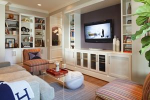
Neutral gray anchors a stunning purple accent wall
Such a dramatic color may send some clients running for the familiar comfort of neutrals, but before you panic, “look to grays to anchor a pop of purple,” says Christopher Patrick, Wentworth’s Interior Designer. In a recent Chevy Chase, MD remodeling project, Wentworth’s interior designers created a perfect visual balance, offsetting a purple accent wall with neutral gray surrounding walls. The result is the perfect fusion between contemporary design and day-to-day livability.
Contemporary interior design is further expressed in Benjamin Moore’s “Spirited” collection. Described as a way to beat the winter blues, bright teals are paired with neutrals to create a calming and elegant effect. “Look for unexpected color pairings in 2011,” says our interior designer, Christopher.
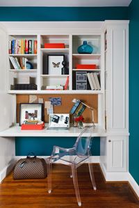
Unexpected color pairing with exceptional results in a home office
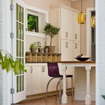
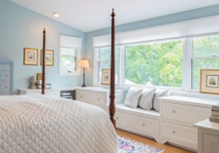
2011’s top paint colors may also reduce stress and tension. That’s right. Pale hues, such as pale blue, can create an overall feeling of tranquility. And calming interiors aren’t just for bedrooms. During a Chevy Chase, MD kitchen remodel, the Wentworth interior design team suggested a pale blue for the home’s busiest room. The kitchen is now a relaxing and stylish hub, perfect for entertaining family and friends.
For more information on interior design and paint colors, contact Wentworth today!